

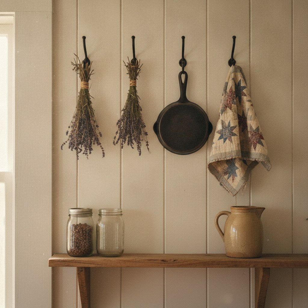
Where Hearts and Home First Met on a Kitchen Wall
The kitchen wall has been a bulletin board for who a family is for a lot longer than most people realize. Long before farmhouse aesthetic was a Pinterest category, families were hanging things in their kitchens on purpose — not to impress guests, but because the kitchen was where everyone actually lived. The hearth was the anchor. The wall above it was the announcement.
The tradition of marking that space goes back to at least the early American colonial period, when families hung dried herbs, braided garlic, and hand-stitched samplers within arm's reach of the fire. Those samplers — the ones with Bible verses and alphabet rows that look quaint now — were functional literacy tools stitched by children learning to read and sew simultaneously. They hung in the kitchen because that's where the family gathered, not because someone thought they'd look nice with the curtains.
The idea of hearts and home as a kitchen theme has roots in that same instinct: the kitchen is where the family is most itself, and the walls should say something true about that. What's changed over the centuries is mostly what "true" looks like.

What People Get Wrong When They Decorate a Kitchen Wall
The most common mistake isn't bad taste. It's decorating for a version of the family that doesn't exist yet — or doesn't exist at all. You know the kitchen. Subway tile, open shelving, a chalkboard wall with a quote about coffee in cursive. It looks like a kitchen from a magazine, which means it looks like nobody's kitchen in particular.
The wall decor that actually works in a kitchen is the stuff that would embarrass you slightly if a stranger read it, because it's specific. Not "Gather" in block letters — anyone could hang that. The sign that says your family burns dinner on Tuesdays and considers it a tradition. The one that admits the cook doesn't take suggestions. The one that's been on that wall so long the kids can recite it without looking.
Generic decor fills space. Personal decor holds space. There's a real difference, and you feel it the moment you walk into a kitchen that has one versus the other. If you want a starting point for thinking about what tone fits your kitchen's personality, the post on joyful cooking and kitchen style gets at this well — it's less about aesthetics and more about attitude.
The second mistake is treating the kitchen wall like a gallery wall in a living room — too many pieces, too evenly spaced, too curated. Kitchens are working rooms. The wall should have a focal point, not a committee.
The Steps, In Order: How to Choose What Actually Goes Up
Getting this right is less about design rules and more about answering a few honest questions before you buy anything.
- What does this kitchen do? A kitchen where someone bakes bread every Saturday morning is a different room than one where the oven mostly stores sheet pans. The wall should reflect the actual kitchen, not the aspirational one.
- Who is the audience? If it's just your household, hang what makes you laugh or feel grounded when you walk in at 7 a.m. If you entertain regularly, you have a little more reason to think about what guests read first.
- What's the dominant tone? Warm and sentimental, dry and funny, faith-forward, food-obsessed — pick one and commit. A kitchen wall that tries to be all of these at once reads as indecisive.
- Where does your eye land naturally? Stand in the doorway. Whatever wall you look at first is your primary wall. That's where the anchor piece goes. Everything else is supporting cast.
- What size actually fits? Measure before you fall in love with something. The space between the top of the stove and the bottom of the hood is not the same as it looks in a photo.
Once you've answered those, the shopping part gets much easier. You're not browsing anymore — you're confirming.
◆ From the Workshop: When you're transferring a curved profile from one carved piece to another — say, an arched sign top — the old patternmaker's trick is to rub chalk or pencil graphite on the face of the finished piece, press it firmly against the blank, and lift. The high spots leave a ghost impression of exactly where wood needs to come off. It's faster than scribing, more accurate than eyeballing a curve freehand, and the transfer is the actual shape, not your interpretation of it. Old patternmakers called it kissing the profile, and once you've done it you'll wonder why you ever reached for a ruler on a curved layout.
Frequently Asked Questions
What size sign works best on a kitchen wall without overwhelming the space?
A good rule of thumb: the sign should occupy roughly two-thirds the width of whatever it's hanging above — a shelf, a window, a stretch of backsplash. Going narrower makes it look like an afterthought. Going wider makes it compete with the architecture. For most standard kitchen walls, that lands you somewhere between 16 and 24 inches wide. If you're filling a tall, narrow space between cabinets, prioritize height over width and look for a vertical layout.
Is it okay to mix different sign styles — rustic wood, metal, and printed canvas — in the same kitchen?
Yes, but give them a common thread. That thread can be color (all neutrals, all black lettering), material finish (all matte, nothing shiny), or tone (all humorous, all sentimental — not one of each). The mistake isn't mixing media; it's mixing moods. A carved hardwood sign next to a distressed metal piece can look intentional and layered. A carved hardwood sign next to a glossy inspirational poster usually looks like two different people decorated the room on different days.
How do you hang a heavy wooden sign on a tile backsplash without drilling into the tile?
Command strips rated for the sign's weight work on smooth, sealed tile if the surface is clean and dry — wipe it down with rubbing alcohol first and wait a full hour before pressing the strip. For anything over about four pounds, use a picture rail or a small ledge shelf above the tile line instead, and let the sign lean or hang from there. Drilling into grout lines (not the tile face itself) is also an option if you want something permanent — grout is far easier to repair than a cracked tile.
Hearts and Home Through the Decades: A Short, Honest Timeline
Kitchen wall decor has tracked cultural mood pretty faithfully, which makes it more interesting than it sounds.
In the 1930s and 40s, kitchens were small and utilitarian, and what hung on the walls was practical — a calendar from the feed store, a clock, maybe a framed prayer. Sentiment was implied, not announced. By the 1950s, the kitchen had become a showroom for postwar optimism, and the walls started getting cheerful: rooster motifs, fruit prints, hand-painted tile plaques. The hearts and home instinct was there, but it came dressed in chickens.
The 1970s brought macramé and herb gardens and a general return to handmade things, which in retrospect was the most honest decade for kitchen decor. People hung what they made or what someone they loved had made. The 1980s overcorrected hard — brass everything, geese in bonnets, stenciled ivy borders that someone spent a full weekend applying and then spent a decade regretting.
The farmhouse revival of the 2010s brought wood back, which was genuinely good, and brought "Live Laugh Love" with it, which was less good. The instinct was right — real materials, real words, something that felt handmade. The execution got mass-produced fast.
Where that leaves us now is interesting. There's a real hunger for kitchen decor that's specific and durable — something that looks like it belongs to this family, not to a trend cycle. That's the conversation worth having, and it's why the history of the kitchen as the heart of the home keeps coming up in different forms. The instinct is old. The execution is just catching up.

What Done-Right Looks Like: Hearts and Home on a Real Kitchen Wall
A kitchen wall that's working has a few things in common, regardless of style.
First, there's one piece that does the heavy lifting — the anchor. It's large enough to hold the wall without help, and it says something specific enough that you couldn't swap it into a stranger's kitchen without it looking wrong. That specificity is the whole point. Hearts and home as a concept only means something when it's attached to a particular home, a particular set of people who burn dinner and argue about the thermostat and make coffee before they can form sentences.
Second, anything else on the wall supports that anchor rather than competing with it. A small shelf with a plant. A hook for dish towels. A clock that actually tells time. The anchor speaks; everything else just holds its position.
Third — and this is the one people skip — the piece is made of something that improves with time. Printed canvas fades. Chipboard warps. Wood, properly dried and finished, gets better. It picks up the light differently as it ages. It develops a patina that a brand-new piece doesn't have, and that patina is part of what makes it feel like it belongs. If you want something that's still hanging there in twenty years and looks like it earned its place, material matters.
A carved hardwood sign like this rustic kitchen gathering sign is the kind of anchor piece that reads immediately and ages well — the message is specific enough to mean something, and the wood only gets better. That's the combination that's hard to fake.
If you want to keep browsing for the right fit, the full kitchen signs collection is where we keep everything — organized by tone, so you can find funny or sentimental without having to wade through both.
The kitchen wall is a small thing. But it's also the first thing you see when you walk in half-asleep at six in the morning, and the last thing you see when you turn off the light. What it says matters more than most people give it credit for. Put something true up there. Something that belongs to your family specifically, not to the general idea of one. That's what hearts and home has always meant — not a style, but a commitment to being somewhere particular, with people you'd choose again.
Share:
What Does Blessed Mean? How One Word Went From the Sermon to the Kitchen Wall | Bluegrass Gifts
Why Small Towns Still Do Homecoming: The Friday Night Lights Meaning That Refuses to Die | Bluegrass Gifts