
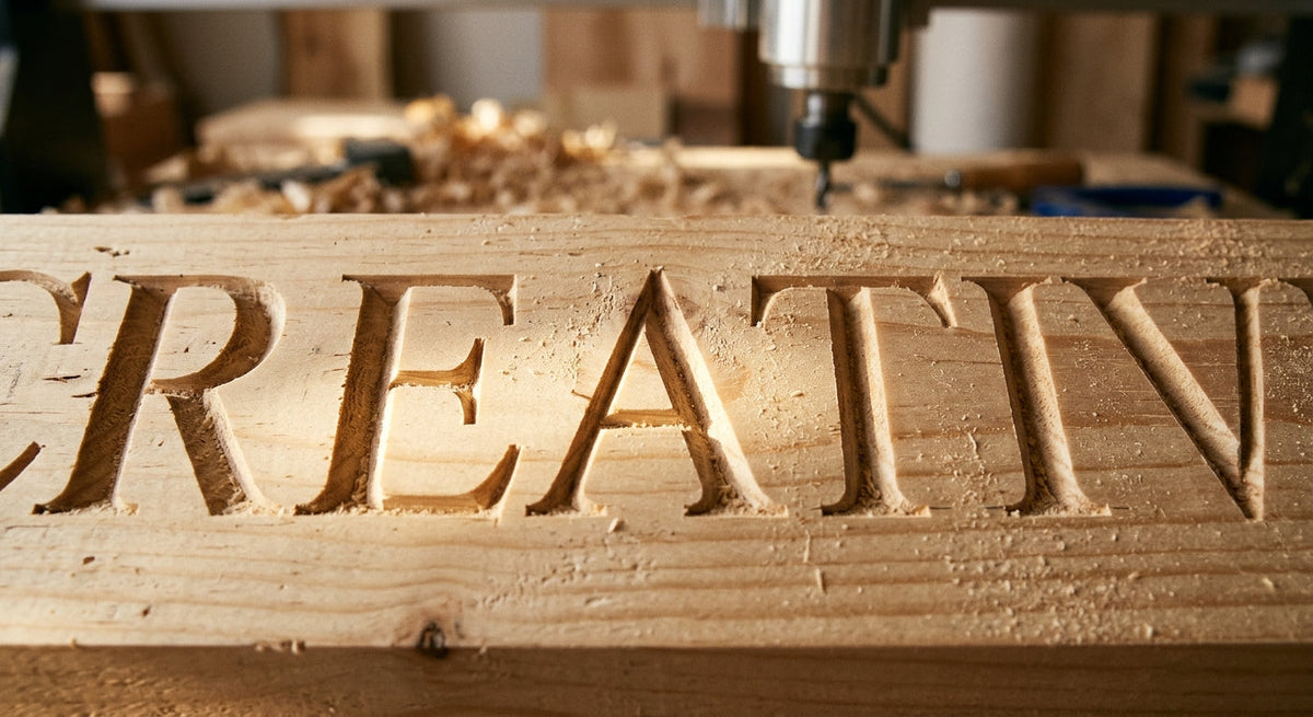

We carve signs every day, and the questions that land in our inbox are almost never about fonts or stains. They're about geometry. How deep will this carve? Why did my script letters disappear? What bit should I buy first? Can you read a 2-inch letter from the street?
None of that is a matter of taste. V-carved lettering is governed by one triangle, and once you understand it, every carving decision — bit, font, letter size, board thickness — follows from it. This page is the reference we wish had existed when we started. Bookmark it, argue with it, link your forum friends to it.
The one formula that runs everything
A V-bit is a spinning cone. When it carves a line, the width of that line at the surface and the depth of the cut are locked together by the bit's angle. There is no setting on your machine that changes this. For a bit with included angle θ cutting a stroke of width w:
depth = (w ÷ 2) ÷ tan(θ ÷ 2)
You never have to compute the trig yourself. It collapses into three numbers worth memorizing:
| Bit | Depth for a given stroke width |
|---|---|
| 90° | depth = 0.50 × stroke width |
| 60° | depth = 0.87 × stroke width |
| 30° | depth = 1.87 × stroke width |
▨ Diagram: cross-section of three V-grooves, same surface width, showing the 90°, 60°, and 30° depth difference.
Read that table again, because it explains most of the mysteries in v-carving. A 30° bit cuts almost four times deeper than a 90° bit for the same width of line. That's why your "engraving" bit blew through a 3/4" board on big letters, and why your 90° bit made wide letters look like shallow puddles.
What this means in real numbers
Here's the same relationship as a working table. Stroke width is the thickness of a letter's line — not the letter's height. (We'll connect those two in a minute.)

| Stroke width | 90° bit | 60° bit | 30° bit |
|---|---|---|---|
| 1/8" (0.125") | 0.063" deep | 0.108" | 0.233" |
| 1/4" (0.25") | 0.125" | 0.217" | 0.467" |
| 3/8" (0.375") | 0.188" | 0.325" | 0.700" |
| 1/2" (0.5") | 0.250" | 0.433" | 0.933" |
| 3/4" (0.75") | 0.375" | 0.650" | 1.400" |
| 1" (1.0") | 0.500" | 0.866" | 1.866" |
Two hard limits jump out of that table.
First, board thickness. A standard 1x board is 3/4" thick. Look at the 30° column: any stroke wider than about 3/8" wants to carve deeper than half your board. Past that you're flirting with carving through, and long before that you've weakened the board along the letter lines. Our shop rule: total carve depth stays under half the board thickness. For 3/4" stock that means 3/8" max depth, which caps a 60° bit at roughly 7/16" strokes and a 30° bit at about 3/16".
Second, flute length. Cheap V-bits often have less cutting flute than their catalog photo suggests. If the math says 0.9" deep and your bit has 0.6" of flute, the shank rubs, burns the wood, and you learn about it from the smell.
Flat-depth carving: how big letters get carved at all
So how does anyone carve a 6-inch-tall bold letter with a 1.5-inch stroke? Not with pure v-carving — the depth would be absurd. Every serious CAM program (Carbide Create, VCarve, and the rest) offers a flat depth setting: the V-bit carves the crisp angled walls down to your set depth — say 0.2" — and then the bottom of wide areas gets cleared flat, usually by an end mill doing pocket duty.

The result is lettering with V-carved edges and a flat floor. From six feet away it reads identically to a full V-groove, it carves in a fraction of the time, and your board keeps its strength. Practically all large carved signage you've ever admired was cut this way. If you take one workflow habit from this page: set a flat depth on anything with strokes wider than about 1/2", and let a clearing bit do the hauling.
▨ Diagram: cross-section comparing full V-groove vs. flat-depth carve of a wide stroke.
Connecting fonts to stroke width
The table above runs on stroke width, but you choose fonts by letter height. The bridge between them is the font's weight. Measured across common sign fonts, stroke width as a fraction of capital-letter height runs roughly:
| Font style | Stroke ≈ fraction of cap height | 3" tall letter → stroke |
|---|---|---|
| Light script (thin-stroked wedding scripts) | 1/20 – 1/12 | 0.15" – 0.25" |
| Book/regular serif (Times, Georgia) | 1/10 – 1/8 | 0.30" – 0.38" |
| Bold serif / slab (Rockwell, Clarendon) | 1/6 – 1/5 | 0.50" – 0.60" |
| Heavy rounded (Cooper Black and kin) | ~1/4 | 0.75" |
Now the earlier mysteries dissolve. Why did your delicate script vanish after staining? A 3-inch script letter has strokes around 0.2". With a 90° bit that's a 0.1"-deep scratch — there isn't enough carved wall to catch light or hold contrast. Thin fonts need steep bits: that same script with a 30° bit carves nearly 0.4" deep, and suddenly there's a shadow line you can read across the room.
And why did Cooper Black stall your machine? A 4-inch Cooper letter carries strokes near an inch wide. Without a flat depth, even a 90° bit wants to go half an inch down across broad areas — a huge volume of wood for a V-bit to move. Bold fonts need flat-depth carving, full stop.
Our defaults, earned through a lot of scrapped boards: 60° for most sign work between 1.5" and 5" letters. 30° for fine script and anything under an inch. 90° plus flat depth for big and bold. If you only buy one bit, buy the 60°.
Letter size is its own subject
Carve depth decides whether letters hold shadow and contrast; letter height decides whether anyone can read them from where they stand. The short version: an inch of letter height per ten feet of reading distance, and in our experience an unpainted carve gives up about a third of that. The full numbers — including moving traffic, contrast, and case — live in our letter height visibility chart, which is the companion page to this one. Here, the relevant point is that depth and height trade against each other: weather softens carved edges over time, so a shallow 0.1" carve outdoors has no legibility budget to spend, while a deep 60° carve with dark paint in the grooves is honestly the most legible thing we make.
Wood is not a bystander
The same file carves differently in different species, and the geometry interacts with the material. Our shop carves pine and poplar daily, so those two are first-hand; the rest is the trade knowledge every carver absorbs.
Pine carves fast and cheap, but its alternating hard-and-soft growth rings mean a steep bit in a thin stroke can wander a few thousandths as it crosses rings — visible as slightly wavy line edges in the worst boards. Slower feeds and a sharp bit mostly cure it. Fuzzing on the uphill side of grain is normal; a light hand-sanding pass after carving is part of the job, not a failure.
Poplar is our answer for fine work, and it deserves more respect than it gets. Tight, even, nearly invisible grain holds crisp V-walls at stroke widths where pine fuzzes — thin script, small dates, delicate serifs all carve cleaner in poplar, and it's barely more expensive. When a design's strokes drop under about 3/16", we move the job to poplar without asking.
Among the premium species: oak holds V-walls boldly but can chip out on details narrower than its own grain lines; maple's tight grain makes it the traditional fine-detail carving wood at a higher price than poplar; and walnut offers built-in contrast — its freshly carved interior comes up lighter than the dark surface, so an oiled walnut carve reads with no paint at all. Good woods, honestly not necessary for most painted and stained sign work.
The failure gallery
Every one of these has come out of our own machine at some point.
Letters carve deeper than the software preview showed. Your board isn't flat, or your Z-zero was set on a high corner. V-carving translates any error in surface height directly into stroke-width error — 0.02" of extra depth on a 60° bit widens every line by 0.023". Surface the board or probe multiple points.
Sharp inside corners look rounded. They aren't — there's fuzz packed in the corner. Steeper bits leave tighter corners; a vacuum pass and stiff brush usually reveal a corner that was fine all along.
The centerline of strokes shows a flat ridge. Two passes didn't overlap; your stepover is too large for the bit, or the toolpath was calculated for a different bit angle than what's in the collet. The angle in the software must match the steel. A "60°" budget bit that actually measures 62° will visibly mis-carve a file computed for 60°.
Paint bleeding past the carve line. Not a geometry problem, but it ruins geometrically perfect work: seal the carve (shellac or finish coat) before flooding the letters with paint, then sand the surface back. The crisp line was always there.
The short version, for your shop wall
Depth = half the stroke width divided by tan of half the bit angle — or just remember 0.5×, 0.87×, and 1.87× for 90°, 60°, and 30°. Keep total depth under half the board. Flat-depth anything with strokes past a half inch. Steep bits for thin fonts, shallow bits plus clearing for fat ones. An inch of letter height per ten feet of reading, minus a third if the carve is unpainted. And the software's bit angle has to match the bit.
Questions about a specific project? We carve custom signs daily in our Kentucky shop and we're happy to sanity-check your numbers — or carve the thing for you.
Everything above is how we run our own files. If you would rather see the geometry than compute it, every sign in the shop is V-carved to these rules in solid pine or poplar, in three sizes and twenty stains. The best sellers are a fair place to see how carve depth actually reads from across a room.
Frequently Asked Questions
How deep should V-carved letters be? Depth follows automatically from the bit angle and the stroke width: depth equals half the stroke width divided by the tangent of half the bit angle. In practice that means a 90° bit carves half the stroke width deep, a 60° bit about 0.87 times, and a 30° bit about 1.87 times. Keep total depth under half the board's thickness.
What angle V-bit is best for sign making? A 60° bit is the best single choice for most sign lettering between 1.5 and 5 inches tall. Go steeper — 30° — for fine script and letters under an inch, where a shallow bit leaves grooves too faint to read. Use a 90° bit with a flat-depth setting for large, bold lettering, where its shallower cut keeps depth manageable.
Why do my V-carved letters look wrong at the set depth? The most common causes are an unflattened board or a Z-zero set on a high spot — any surface-height error changes stroke width directly. The other frequent culprit is a mismatch between the bit angle in the software and the actual bit in the collet: toolpaths computed for 60° carve visibly wrong with a bit that measures even a few degrees different.
Use these diagrams
Both diagrams on this page are free to reuse in your own posts, class handouts, or forum answers, unmodified, with a link back to this page as the source. Copy-paste embed code for the bit-angle diagram:
Embed the bit-angle diagram
Displays the diagram and credits this page. Swap the image URL for the flat-depth diagram if you need that one instead.
Share:
Best Wood for Outdoor Signs (From a Shop That Carves Pine and Poplar Daily)
Best Finish for Outdoor Wood Signs: What Actually Survives Weather