

A sign letter needs about one inch of height for every ten feet of comfortable reading distance. A 3-inch letter reads well at 30 feet, a 6-inch letter at 60 feet. Letters stay technically readable to roughly double those distances, but a sign people squint at has already failed. That's the whole rule — the chart below turns it into exact numbers, and the rest of this page covers the cases where the rule bends: dark rooms, moving cars, low contrast, and carved or dimensional lettering, which behaves differently than print.
We make signs for a living, and letter height is the decision customers get wrong most often — almost always by going too small. Wall space feels big when it's empty. So before the chart, one piece of shop advice: when you're between two sizes, take the larger one. Nobody has ever told us their letters came out too big.
The chart
| Letter height | Best readability | Maximum readability |
|---|---|---|
| 1" | 10 ft | 30 ft |
| 2" | 20 ft | 60 ft |
| 3" | 30 ft | 100 ft |
| 4" | 40 ft | 150 ft |
| 6" | 60 ft | 200 ft |
| 8" | 80 ft | 350 ft |
| 10" | 100 ft | 450 ft |
| 12" | 120 ft | 525 ft |
| 15" | 150 ft | 630 ft |
| 18" | 180 ft | 750 ft |
| 24" | 240 ft | 1,000 ft |
Two columns because the sign industry measures two different things. "Best readability" is the distance where letters register instantly without effort — this is the column to design against. "Maximum readability" is where letters can still be deciphered by someone actively trying. Marketing a business on maximum-readability numbers is how parking lots end up full of signs nobody reads.
Reading the chart backwards
Most people come at this with a distance and need a height, so run it in reverse: measure the real viewing distance, divide feet by ten, and that's your minimum letter height in inches.
Or let the calculator do it
Enter your real viewing distance (or flip the mode and start from a letter size) — the calculator applies the chart plus the traffic, carving, and script-font adjustments explained below.

The measuring is where it gets honest. A front-door welcome sign isn't read from the door — it's read from the sidewalk, which might be 25 or 30 feet away, and suddenly those pretty 1.5-inch letters are decoration, not communication. A sign over a store counter gets read from the entrance, not the register. Walk to where the actual reader actually stands, count your paces, and size from there.
Indoors the distances are shorter and the rule relaxes. A sign above a couch or mantel is read from across the room — call it 12 to 15 feet — so 1.5 to 2-inch lettering carries fine, and the sign's overall proportions matter more than raw legibility. Our rough guide for over-furniture signs: the sign itself should span somewhere near two-thirds the width of the furniture beneath it, and the lettering follows from whatever fits that sign gracefully.
Cars change the math
A reader in a moving vehicle doesn't get to stand and look. At 30 mph a driver covers 44 feet every second, and highway studies give a driver roughly one second of attention for a roadside sign — often less with traffic to watch. The practical effect: for drive-by signage, take the chart distance and then add letter height until the message survives a one-second glance. Businesses on 35–45 mph roads generally need 10 to 12-inch letters for the primary word, whatever the chart says about standing viewers. Secondary information — hours, phone numbers — mostly cannot be made readable from a moving car at any sane size, which is why good road signs say one thing.
Contrast is half of visibility
Every number above assumes dark letters on a light ground or the reverse — the high-contrast case the studies were built on. Weak contrast shrinks reading distance dramatically, and some classic "beautiful" combinations are legibility disasters: gold on white, red on black at distance, anything tone-on-tone.
Carved wood signs — our corner of this world — have their own contrast physics worth understanding before you size lettering:
An unfinished or clear-coated carve gets its legibility purely from shadow inside the letter grooves. It reads beautifully up close and in angled light, and in our experience it quietly gives up roughly a third of the chart distance in flat light. Size up accordingly, or light it deliberately.
A carve with painted or dark-stained letters against a lighter board performs at full chart distance — the carving adds depth and permanence while the contrast does the legibility work. This is the configuration we recommend whenever a carved sign genuinely needs to be read from far away rather than admired from near.
Raised or dimensional letters (the reverse of carving) cast stronger shadows and can slightly beat the chart in good light, which is one reason storefront signage leans that way.
Case and typeface move the numbers too
Study after study lands the same place: mixed-case words read faster than all-capitals at the same letter height, because word shapes stay distinctive. ALL CAPS reads as rectangles. Capitals still make sense for very short words that function as symbols — EXIT, OPEN, a family surname — but a phrase set in caps needs taller letters to hit the same distance.
Stroke weight matters as much as height. A thin, elegant script at 4 inches can be outread by a sturdy 3-inch serif, because the strokes carrying the information are what the eye resolves at distance. If a delicate typeface is non-negotiable — wedding signage lives here — compensate with size and contrast. We cover the carving-specific side of stroke width, bit angles, and depth in our guide to how deep to V-carve letters, because on a carved sign the typeface's stroke width physically determines how deep the letters cut.
Worked examples from the shop
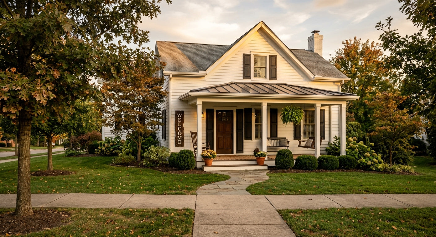
A porch welcome sign read from the street, 35 feet away: the chart says 3.5-inch letters minimum for the main word. A vertical welcome sign with 4 to 5-inch letters is the classic solution — the format exists because the math demands it.
An established-family sign above a mantel, read from 14 feet: 1.5-inch minimum, and 2 to 2.5 inches for the surname looks intentional rather than shy. The date line can drop smaller; it's read from close up, on approach.
A business sign on a 40-mph road, 60 feet from the traffic lane: chart minimum 6 inches — then the moving-car correction pushes the business name to 10 or 12 inches, and everything except the name comes off the sign entirely.
A booth banner read across a craft-fair aisle, 15 feet: 2-inch letters minimum, 3 for the name. The most common banner mistake we see is sizing for the person standing at the table, who already found you.
Download the data
The table behind this page is free to reuse under CC BY 4.0 — spreadsheet, app, classroom, or your own site. Credit Bluegrass Gifts with a link back.
letter_height_readable_distance.csv
Cite as: Bluegrass Gifts LLC (2026). Sign Letter Height vs. Readable Distance (v1.0.0) [Data set]. https://bluegrassgifts.com/blogs/bluegrass-gifts-blog/letter-height-visibility-chart
If you are sizing a sign rather than building one, here is how our three sizes land against the chart. Small is 16 by 3.5 inches, Medium is 24 by 5.5, and Large is 30 by 7.25. The Medium reads comfortably across a room; the Large is the one that still works down a hallway or from the end of a driveway. All three are in the shop, and the entryway, porch and yard signs are the ones meant to be read from a distance.
Frequently Asked Questions
How big should letters be on a sign? One inch of letter height per ten feet of viewing distance is the standard. Measure from where readers actually stand to where the sign hangs, divide the feet by ten, and that's the minimum letter height in inches. When in doubt between two sizes, choose the larger — undersized lettering is the most common signage mistake.
How far away can you read 3 inch letters? Three-inch letters read comfortably at about 30 feet and remain decipherable to roughly 100 feet under high contrast. In flat lighting, with weak color contrast, or on an unpainted carved sign, expect noticeably less. For readers in moving vehicles, treat 30 feet as optimistic and size up.
What size letters can you read from the road? For traffic at 30–45 mph, plan on 10 to 12-inch letters for the primary word so the message survives a one-second glance. Secondary text like hours or phone numbers generally can't be made road-readable at reasonable sizes, so effective road signs limit themselves to one message.
Use this chart on your own site

Embed this chart
This chart is free to republish on your website, blog, or forum post. Copy the code below - it displays the chart and credits this page as the source. That link back is the only thing we ask.
Share:
What Does 'Be Still and Know' Actually Mean? The Most Misunderstood Verse in the Bible | Bluegrass Gifts
Best Wood for Outdoor Signs (From a Shop That Carves Pine and Poplar Daily)