

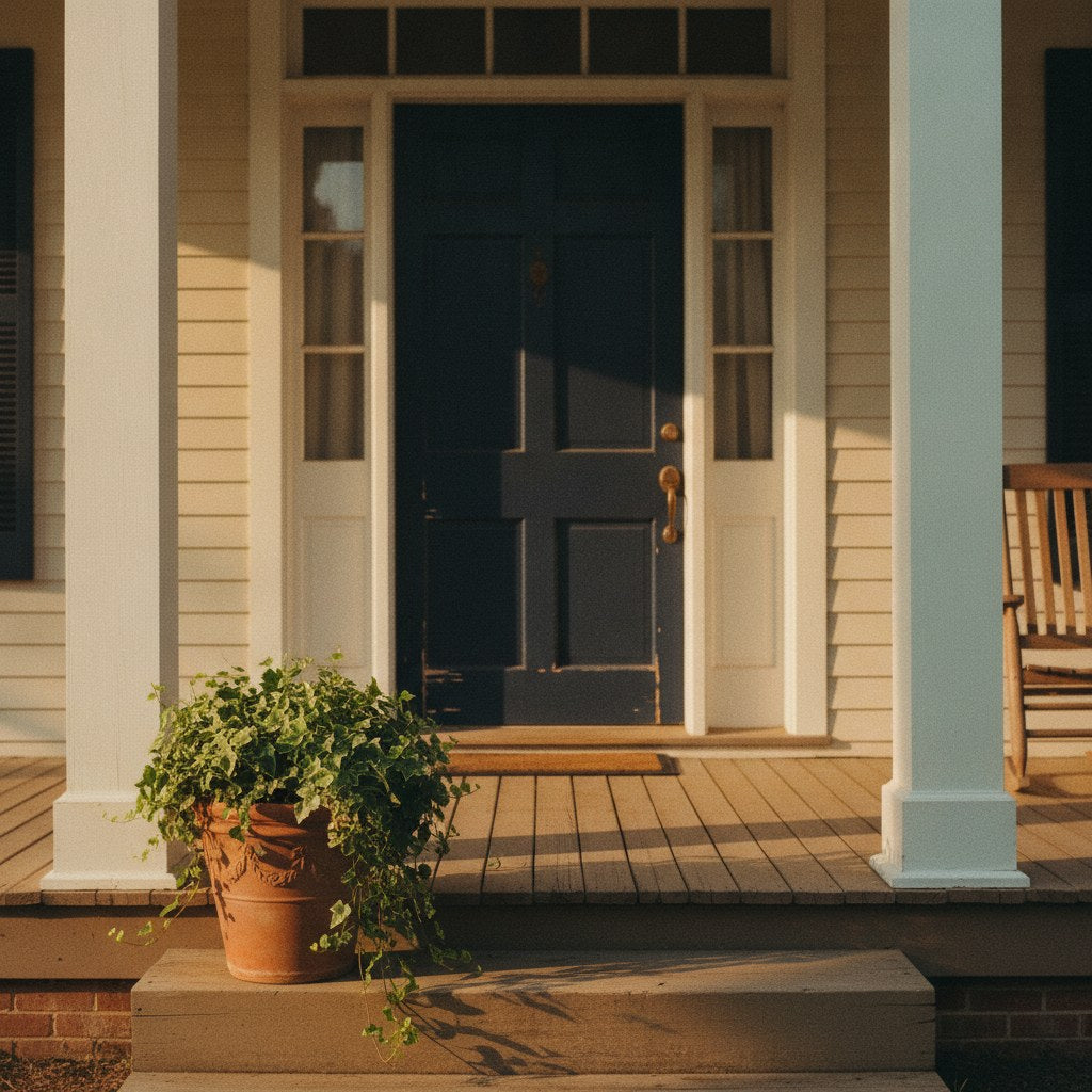
Front Door Color Meaning Starts Before Anyone Knocks
Your front door color is making a statement about you right now. Not because you sat down and crafted one — but because everyone walking past your house is reading it anyway, filling in the blanks with whatever their particular mix of cultural shorthand and personal taste tells them to. You didn't opt into this. It's just how it works.
The claim I want to stake here is simple: front door color meaning is real, it's consistent enough to be useful, and most homeowners are leaving it entirely to chance. That's fine if you don't care. But if you've ever stood in the paint aisle for forty minutes holding two chips that look identical in fluorescent light, you might as well know what you're actually deciding.

What the Front Door Color Tells Your Neighbors (Whether You Like It or Not)
The strongest counterargument to all of this is that color psychology is soft science dressed up in confident language — that Sherwin-Williams calling a shade "Confident Red" doesn't make red doors project confidence any more than naming a crayon "Macaroni" makes it taste like pasta. That's fair. Color associations vary across cultures, shift over decades, and get muddied by context the moment you add brick versus vinyl siding into the equation.
But here's where it falls apart as a complete objection: neighbors aren't running controlled experiments. They're making fast, unconscious reads based on exactly the kind of cultural shorthand that color companies are packaging. The associations don't have to be scientifically airtight to be socially real. They just have to be shared widely enough to operate as a kind of neighborhood vocabulary. And they are.
Real estate agents — who spend their careers watching buyers react to exteriors before they've seen a single interior room — tend to group front door colors into rough personality reads that are remarkably consistent across markets:
- Black: Formal, confident, low-maintenance personality. The door of someone who made a decision and stuck with it. Agents often describe it as the color that photographs best and argues least with other exterior elements.
- Red: The traditional welcome color in American folk culture — a red door historically meant travelers could stop for shelter. Today it reads as social, warm, a little bold. In some regions it still carries that specific hospitality signal.
- Navy or deep blue: Trustworthy, stable, slightly buttoned-up. The door equivalent of a firm handshake. Popular in neighborhoods where the houses were built before 1980 and the owners plan to stay another twenty years.
- Yellow or bright green: Optimistic, creative, possibly the most opinionated door on the block. Neighbors either love it or they're quietly relieved it's not next door to them.
- White or off-white: Clean, classic, noncommittal. Could mean the owner has excellent taste and knows it. Could mean they couldn't decide. The door itself won't tell you which.
- Gray: Modern, careful, probably has a strong opinion about kitchen hardware. Gray doors became ubiquitous enough in the 2010s that they now read as slightly safe — which is either a feature or a bug depending on your goals.
None of this is destiny. But if you're choosing a front door color and you want the house to say something specific, it helps to know what the existing vocabulary is before you start talking.
◆ From the Workshop: The sapwood of a freshly cut log — that pale outer ring just beneath the bark — is essentially still alive with moisture and nutrients, which is exactly why it rots and gets eaten by insects so much faster than the darker heartwood at the center. Old timber selectors would count the sapwood rings on a cut end and reject any log where the pale band was more than an inch thick, knowing that wood would be worm-riddled within a season if left untreated. The heartwood survives because the tree has already filled those cells with tannins, resins, and other natural preservatives — it's the wood that's already done living, and that's precisely what makes it worth building with. There's a lesson in there about choosing materials that have already proven themselves, whether you're picking lumber or paint.
Frequently Asked Questions
Does front door color actually affect home resale value?
It can, in a narrow way. A 2018 Zillow analysis found that black front doors were associated with homes selling for a premium compared to national averages — but correlation isn't causation, and a lot of that effect likely comes from the fact that black doors tend to appear on well-maintained, updated homes to begin with. The color alone won't save a peeling porch. What appraisers and buyers actually respond to is contrast: a door that reads clearly against the facade signals intentional upkeep, whatever the hue.
Are there HOA rules about front door colors?
More often than people expect, yes. Many HOAs — especially in planned communities built after 2000 — maintain an approved color palette, sometimes down to specific paint brand codes. Before you commit to that fire-engine red, pull your CC&Rs or send a quick email to your association. The approval process is usually simple, but skipping it can mean a formal notice and a mandatory repaint at your own expense. Some historic districts go even further, requiring colors that match documented period palettes for the neighborhood.
What's the best front door color for a shaded or north-facing porch?
North-facing doors get less direct sun, which means cool-toned colors — grays, blues, greens — tend to look flatter and sometimes dingy without natural warmth to activate them. Designers generally recommend warmer neutrals (creamy whites, soft blacks, deep navies with warm undertones, or earthy reds) for low-light exposures because they hold their depth even in shadow. Gloss finish also helps: it catches ambient light and keeps the door from looking dull on overcast days, which matters a lot in climates that run gray from November through March.

What One Very Opinionated Paint Company Gets Right About Front Door Color
Paint companies are not neutral parties in this conversation. They have an obvious interest in making you believe that color choice is a meaningful, identity-defining act — because that belief sells more paint. Sherwin-Williams, Benjamin Moore, and Behr all publish annual color forecasts with the gravity of papal declarations, and the names they assign to colors do real psychological work. "Accessible Beige" communicates something different than "Antique White" even when the chips are nearly indistinguishable under a kitchen light.
That said, the color trend data these companies publish is genuinely useful, not because it tells you what's objectively good, but because it tells you what's currently legible. A front door color that was considered eccentric in 2005 — deep charcoal, dusty sage, terracotta — can read as sophisticated and intentional in 2024 simply because enough design-forward homeowners adopted it in the intervening years. The paint companies track that drift, and their forecasts are a reasonably honest map of where the cultural consensus is moving.
The practical upshot: if you want your door to read as current without being trendy, look at what the major paint companies were calling "emerging" two years ago. That color has had time to move from early adopters into the broader market without tipping into oversaturation. If you want your door to read as classic and unbothered by trends, black, deep red, and navy have been in continuous use long enough that they've essentially aged out of the trend cycle entirely.
If you want your door to say "I live here and I genuinely don't care what you think," yellow. Always yellow. It's the only front door color that functions as a personality test for the person looking at it rather than the person who chose it.
How to Actually Choose a Front Door Color That Works for Your House
Here's where the opinion piece turns into something useful. The color associations matter, but they operate within constraints set by your actual house — and ignoring those constraints is how you end up with a door that looks great on a Pinterest board and wrong in your driveway.
A few things worth knowing before you commit:
- Undertones are the whole game. A warm red on a house with cool gray siding looks like an argument. A cool blue on a house with warm brick looks like a mistake. Pull the undertone from something fixed — the mortar, the stone, the roof shingles — and let your door work with it rather than against it.
- Finish matters as much as color. A satin or semi-gloss finish on a front door is standard for good reason: it's easier to clean, holds up better to weather, and catches light in a way that makes the color read more richly. Flat paint on a door looks like a primer coat within a season.
- Test it at the right time of day. Paint chips in a store are lit by fluorescents. Your door is lit by morning sun, afternoon shade, and porch light at night. Brush a large swatch on the actual door and live with it for two days before committing.
- The hardware has a vote. Brass hardware with a cool-toned door creates visual tension. Matte black hardware is the most forgiving across color families, which is part of why it's everywhere right now.
If you're also thinking about what goes alongside the door — on the porch, near the entryway — we wrote a whole piece on front porch decor ideas that make an entryway feel genuinely welcoming, and another on how to style a Southern entryway that covers the layering logic pretty well. The door is the headline. Everything else is the sentence that follows it.
For the entryway itself, a carved hardwood sign does something a seasonal wreath can't: it stays. It says the same thing in February that it says in July, which is how you know it's actually true. A carved welcome sign that tells the truth about your hospitality policy is the kind of thing that makes guests laugh on the way in and remember the house long after they've left. If you want to browse what else is out there for porches and entryways, our entryway, porch, and yard signs run the full range from warm to wry.
Your front door color is the first sentence of the story your house tells. It's worth saying something you actually mean.
Share:
Care Symbols on Clothing Tags Make No Sense — A Translation Guide for Normal People | Bluegrass Gifts
How Do Color Changing Mugs Actually Work? The Science Behind the Coffee Mug Humor Reveal | Bluegrass Gifts